Analyzing Costs
Analytics answers the “how am I doing?” question. This lesson walks through the summary cards and vehicle-level breakdowns.
- Review the summary cards: The Analytics tab presents Vehicles, Categories, Energy, and Entries cards at the top. Tap any card to drill into the data set and see how totals and averages evolve over time.
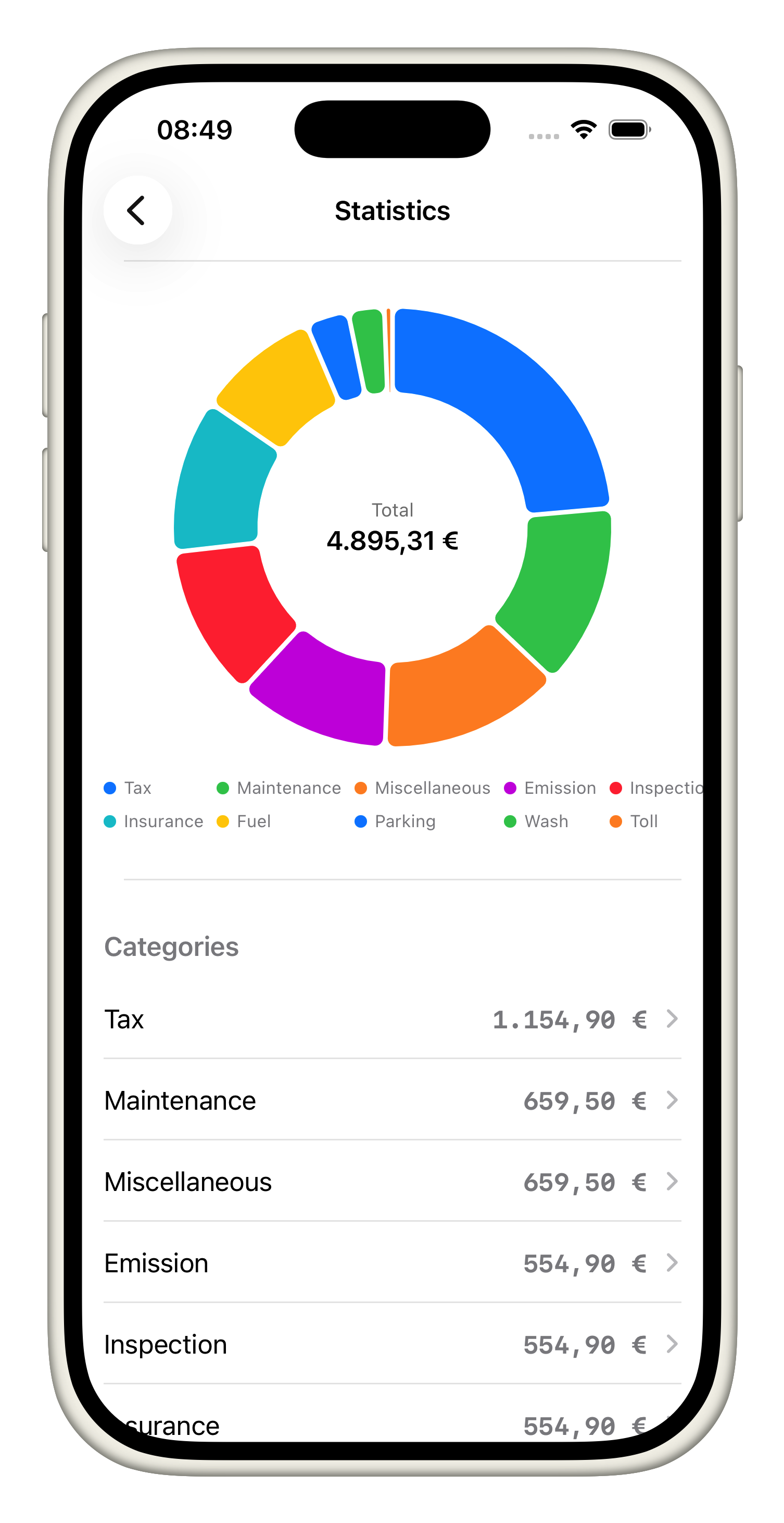
- Inspect a vehicle's pie chart: Scroll to see the pie chart for each vehicle. The slices represent categories, and the legend highlights the biggest spends so you can spot where maintenance, fuel, or tolls dominate.
- Understand cost-per-mile callouts: Below the pie chart, the cost-per-mile and cost-per-month callouts explain how efficiently the vehicle is running. Use these numbers to compare to previous months or to estimate upcoming budgets.
- Use entries to verify data: Tap through the Entries section to see every recorded expense behind the charts. Each item links back to the original vehicle, making audit and clarification easy.
- Share insights: When a teammate asks, export or screenshot a summary card to illustrate trends, knowing all visuals are driven by the data entered in prior tutorials.
These analytics tools turn raw expenses into actionable signals so you can course-correct before problems compound.